

withes_shin
-
Posts
473 -
Joined
-
Last visited
Content Type
Gallery
Downloads
Profiles
Forums
Blogs
Articles
Media Demo
Store
Events
Posts posted by withes_shin
-
-
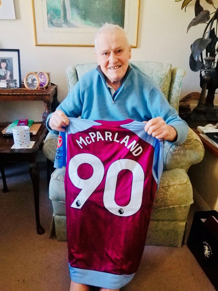
And another version (look at the bag bottom right)

-
 1
1
-
 1
1
-
-
13 hours ago, TRO said:
How did he and Nass come together?
They met at a bonkers nightclub, no jeans, no trainers (© Mark & Lard )
-
2
-
-
- Popular Post
- Popular Post
3 minutes ago, alreadyexists said:I imagine they’ll think of another name for us, possibly of five letters, and ending in unts
Aunts?
-
 5
5
-
Must have been tired after the extra time and penalties in mid week so decided take a rest and have a lion down
-
2
-
-
Up for walking?
He should be running to get to the ground
and skipping all the way back to the car after another fine Villa win

-
1
-
-
14 minutes ago, Jareth said:
I'm getting this
13 minutes ago, Talldarkandransome said:You menace
You minx
-
1
-
-
Hopefully, fingers crossed, not wanting to jinx things or anything, but if we are in the Champions League next season can we can legitimately have a star above the badge as we are a previous winner of the competition.
If we do can the little white star be removed from the European shirt - so giving us another crest to argue over!
Is it possible to mock up a crest with the European star above @Teale's 'tache?
-
1
-
-
54 minutes ago, sharkyvilla said:
One thing I don't get is why the Lille player didn't get booked for booting the ball into the crowd in the first place. Kick the ball away in normal play you get a booking and if he hadn't done that, Emi doesn't have to ask for a ball, then avoids getting a yellow.
Isn't it because the ball is classed as dead after the goalie has saved it? that's why rebounds can't be scored.
-
 1
1
-
-
- Popular Post
- Popular Post
-
6
-
13 hours ago, Mandy Lifeboats said:
Surely his coffin should be taken to the cemetery in a white Ford Bronco followed by 40 Police cars?
You mean like this:

-
Working away down south years ago I was booked into a pub with accommodation, but no breakfast included.
Anyway went for food in the evening and on the specials menu was all day full english breakfast, I asked for the all day breakfast and requested that it be served at 7.00am the following morning - they looked at me like I was a piece of shit!
-
4
-
-
3 hours ago, bickster said:
Bacon: 3 Rashers min - back bacon not streaky, not overcooked either
Sausages: 2 min (and none of this chipolata nonsense) - there should always been at least one more bacon rasher than sausages, undercooked anaemic sausages should be avoided
Eggs : 1 min, preferably 2 soft centred and not flipped so they are white on both sides. Scrambled only acceptable if not overcooked to the point of dryness
Black Pudding: 2 slice min
Mushrooms: Preferable but they should be drained of juice before hitting the plate
Beans: optional, no ramekins
Tomato: optional and not tinned, fresh tomato grilled, 1 and only 1 i.e. two halves
Bread: 2 slices of thick shitey whitey (BUTTERED no marg) or replace 1 with fried bread. Good quality proper bread (white) is also acceptable but not essential
Potato products: this is an F.E.B. not a wacky gastro fusion dish
Items listed in order of importance
We have a winner!
-
I didn't mind the coffee flavoured Quality Street.
-
The award for being top goal scorer in the German league (golden boot equivalent) is a cannon..............how ironic for Kane.
-
Larry Lloyd
Former Liverpool and Forest defender
-
 1
1
-
-
Smokey Joes Cafe just off the A30 near Scorrier in Cornwall was one of the best full english breakfasts I've ever had.
-
1 minute ago, StefanAVFC said:
Did you like the other colourful versions of the flag in previous kits?
Back to the original point - as part of a design doesn't bother me
As a stand alone flag no I don't like it
-
1
-
-
Just now, Stevo985 said:
Mate you suggested the design on Joe Hart’s England kit was a Finnish flag, mate. Mate at this point I don’t honestly know what your point is, mate.
-
1
-
-
As a matter of opinion would anyone be happy with Adidas using Royal Blue and White colourings on our new badge as a playful update so that the whole of Birmingham can feel inclusive?
-
Just now, Stevo985 said:
Well deflected mate
1. I'm not your mate
2. I have not deflected anything
3. I don't like the design of the playful update
4. If it is going to be there at all it should be red on white
5. It is my opinion
6. I think @foreveryoung is attempting to explain things better than me
-
10 minutes ago, Stevo985 said:

Yeah you got me mate. The design on the England goalkeeper shirt, part of the England team, that is in the exact shape of a set George’s cross, the flag of England, isn’t actually a St George’s cross, it’s the flag of Finland.
You’ve outfoxed me there
Took some time to google that one!!


-
3 minutes ago, villa4europe said:
on what basis dont you like it though?
me personally i don't care, i don't know why they chose to do it beyond trying to tie it in to the aesthetic of the detailing on the sleeve
Detailing on the sleeve is fine.
Just don't like the fact that the St Georges flag has been changed on a whim by Nike and the FA have accepted it.
-
Just now, StefanAVFC said:
is this?
No, definitely not.
But we have been told that it is - as it has had a playful update
-
13 minutes ago, Stevo985 said:
Probably the fact that he has eyes and more than one brain cell
So is this a cross of St. George?


Future Club Crest & Brand Identity
in Villa Talk
Posted
Top right or bottom right for me