

greenz
-
Posts
421 -
Joined
-
Last visited
Content Type
Gallery
Downloads
Profiles
Forums
Blogs
Articles
Media Demo
Store
Events
Posts posted by greenz
-
-
Please not Giles Barnes....please not Giles Barnes....please not Giles Barnes
-
GTFO now Lambert
-
-
-
-
Should make a VT Pro club.
Yup, didn't really play Pro clubs much last year, but played a few games now and really enjoying it. I'm on PS3 though... :| anyone else interested?
I'm up for it..

-
Should make a VT Pro club.
Yup, didn't really play Pro clubs much last year, but played a few games now and really enjoying it. I'm on PS3 though... :| anyone else interested?
I'm up for it..
-
So Sainsbury's still the cheapest? I'm off...
-
-
What is this shit, where's the little macron man
It is there... but as these Lazio shirts are fitted for humans and not apes, you can barely see it on top of the shoulders. :x
-
Which kit do you like the best?
Or the away goalkeeper one -
http://www.astonvilladirect.com/stores/astonvilla/products/kit_selector.aspx?pid=116586&cmp=
These ones :oops:
-
I like it - especially on Gabby I think it looks way better untucked than it does when they have it tucked in.
We're Aston Villa we glow in the dark
Haha brilliantHe seems to fill it a lot better than the rest. I think it'll fit those of us with the less than athletic bodies quite well.
-
What is it about the shirt that people are saying it's shit? I don't think it looks as bad as people make it out to be.
I wouldn't go so far as to say it's shit, I just don't personally like it.
It looks cheap, in large part thanks to the design. It's not... classy, harmonious, whatever. The collar is fussy to my eye, the little triangle at the front looks like it came from a different shirt. The Macron bloke on the shoulders makes them look too busy and untidy. The yellow trim at the bottom doesn't really 'fit' the rest of the design, it looks like it was just tacked on to add another detail.
To be honest the whole thing can be described in that way - they realised they need a claret body and blue sleeves, and then they just chucked stuff at it to make the design and none of it really flows together. So they chucked on a collar that has one kind of detail, and added another detail to the front of it, and then chucked on the yellow base trim, and then whacked the Macron blokes in the most convenient place. And then the 'premium' detail is going to be the heat prints lion on the back which you just... know is going to look a bit desperate, as that doesn't really 'fit' in either.
It's not a bad design... it's just not a good one either. You can tell its made by a company not at the top of their game - it's an also ran.
I also think the material looks a bit shit but it's hard to judge that off admittedly poor photos.
It's not hideous, or a travesty... it's just not good either. It reminds me of a few of the more naff early/mid 90s designs somehow - the designers having a field day with the kit and not making a cohesive design, which requires restraint and clear vision.
The away might get away with it a little more, although the colour rumours have me convinced it's going to be hideous.
It's like you literally read my mind.
The away kit will outsell this tenfold if it's as garish as we're expecting -
From what I can tell...
-
Very Nice... Make the claret band on the arms smaller and It would be even better.
-
My latest try at a macron shirt..
-
Amen to that
-
A glimpse of the Spammers new away kit for ya :?
-
Thats 100% fake, why would professional kit designers use photoshop templates that people use for fantasy kit/designs
And old ones at that...
-
Dayglo is a bit much IMO, shopped one and a home too..
-
piss poor. lucky, weren't off by much
-
wtf is going on?
-
If they play.anything like they did last week, they'll hammer us... If not it'll be 0-2. TBH I can't see us scoring
-
what a **** suprise


 Haha brilliant
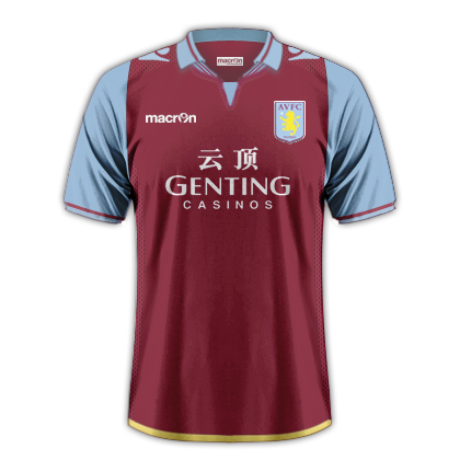


New Kit 2013-2014
in Villa Talk
Posted
Love the kits, hate the sponsor.