

0Lamptey
-
Posts
34 -
Joined
-
Last visited
Content Type
Gallery
Downloads
Profiles
Forums
Blogs
Articles
Media Demo
Store
Events
Posts posted by 0Lamptey
-
-
This is a really interesting question, since every fan tends to come at it from a different perspective, like how it looks flat on a website, what it looks like on the kit, what it looks like in comparison to earlier versions etc. People also have emotional attachments to particular version, which is totally valid.
I think Norwich have done a fantastic job of their crest update. The website gives great detail on the reasons why they adjusted the individual elements and the colours. It also seems to have involved a lot of consultation with fans and groups. I took a quick look at the twitter replies to their announcement and there were a lot just saying ‘this is disgusting’ etc but the only reason given seemed to be that it just wasn’t the old version.
I also think that the Juventus ‘J’ is great. ‘J’ is a very unusual letter in Italian/hardly used, so the club thought it was a unique element to build the crest around, together with the iconic black and white stripes, which are cleverly worked in with the J.
I’m 50/50 on our current crest. I think it looks poor as a flat version both digitally and printed on signage. This is mostly due to the colour though, the tone of the yellow and blue seems to wash together, there’s not quite enough contrast so it always looks much better in one colour. When it is put on a kit, they use the more detailed textured version of the lion and it looks absolutely stunning. Pretty much the best out there as far as I’ve seen.
I don’t really have an issue with the AVFC, although Aston Villa is such a unique name, there’s an argument that it should be included.
I do have an issue with the star. In a strange way I think that it’s small-time, and sure you could fit maybe one more star on the right-hand side of the lion’s head, but there’s no room for 3 or 4 extra stars. How is that for future proofing(!) I think it should sit above the crest and maybe only during seasons when we play in Europe.
Finally, on the shape, there’s a huge trend of modernising to a round crest that’s been going for 5-10 years. Man City’s seems to be the template for a lot of these and I’d like to see the club go for something that is unique to Villa (AC Milan have used their oval very well throughout their club identity). I have always though that the ‘A’ and ‘V’ would come together nicely as a diamond shape, and that the crest shape could be built around this. I can’t think of many other diamond shape crests in world football (Borussia Monchengladback have one and Spartak Moscow have a horizontal version).
The other way to go would be to have a lion on the crest and nothing else. I think the Dutch national team crest is a stunning version of this approach (aside from very small ‘KNVB’ text at the top). Their lion just pops due to the extra detail in the outline and the dark/light contrast.
-
 2
2
-
-
- Popular Post
- Popular Post
Third:

-
5
-
 2
2
-
- Popular Post
- Popular Post
Away based on 1992/93
-
8
-
2
-
- Popular Post
- Popular Post
I've done some sketch concepts based on the Kappa type shirt. Stripes and black change shorts on the home kit would be controversial, but I found some photos of this mash-up when we had Hummel in the David Platt days and I think it works.
-
7
-
2
-
The 3D textured versions of the badge as used on the kits look amazing, probably the best I've ever seen on a kit, but I think it looks a bit basic when it's in flat colours in print and digital. This is so that it is clear at both a very small scale as an icon on a phone and blown up on the side of the stadium, but means it lacks a bit of character overall.
I'd like to see them keep the version of the lion, maybe revert to 'Aston Villa' rather than AVFC, (maybe throw in an 1874 too) and look for a more unique shape that would stand out among all the other circles and shields, maybe a diamond shape. I've always thought a diamond would work well, since the outline is basically an 'A' on top of a 'V'!
-
1
-
-
I’ve generally been happy with Kappa. They seem to put some thought into the designs, particularly the patterns for the away and third last year (unfortunately three great kits were spoiled by the awful W88 sponsor). The retro shirts and tracksuits were a nice touch too. I think we are one of their top 5 clubs (with Napoli, Fiorentina, Monaco, and Real Betis), and their only UK Club, so perhaps we get more of a V.I.P. service. I’d like to see another few years of Kappa, but it’s probably contingent on them ironing out any quality issues and offering an improved financial deal, now that we are established in the Premier League. I have heard rumours that Kappa are about to lose Napoli, so if that happens, they will be even keener to keep hold of us.
Nike, Adidas, and Puma do some great stuff for the bigger clubs (Inter this season, Arsenal 2019, AC Milan this season) but unless you are in the the big 3 manufacturers’ top tier, it seems like a club basically get to pick colour schemes and apply them to a few templates. The Brighton, Wolves, Leeds, Leicester, Palace and Newcastle kits from this season all reek of this approach. I’d like to think we are more attractive to a sponsor than those clubs, by having a bit more recognition globally, but unfortunately we are lagging behind the top clubs commercially, so I’m not sure how much benefit we would get from a deal with one of ‘the big 3’. I like Umbro, but I wonder if they could roll out three sets of claret and blue kits for us, West Ham and Burnley every year.
Hummel have made a comeback over the past few years and have produced some really nice stuff. They have Everton, and Southampton too from next season, I wouldn’t be opposed to them having a third go at our kits after the Kappa deal.
-
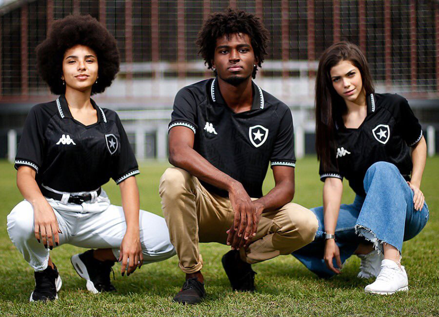
I really like what Kappa have done with the new Botafogo shirt. Includes a collar and classic 90s style subtle pattern in the fabric.
There's more pictures here: https://www.footballshirtculture.com/20/21-Kits/botafogo-2021-kappa-away-shirt.html
Hopefully we get something like this in claret and blue.
-
Hi All,
I am a long-time Villa Fan and a season ticket holder. I have been reading Villa Talk for years. As a graphic designer, I'm particularly interested in the Club's image and identity, and how the new owners will look to improve this both in the local community and globally.
I have an Instagram feed where I post some ideas around football kits and graphics (@totalfootballequip)
All the best.


Aston Villa Kits 22/23
in Villa Talk
Posted
I'm sure the new kits will look a lot better when they are modelled by the players and professionally photographed, but can't help but be very disappointed by these.
The home is fine, but I don't see any real bespoke details or any any design elements that derive from the identity of the Club. This is something that Kappa seemed to work really hard on. The loss of the textured badge is also really sad. Is this a cost cutting thing I wonder?
I also feel Kappa struck a really nice balance between tradition for the older fans and more daring designs that younger fans could wear as 'streetwear'. The third is a stab at that I suppose, but it seems to be a generic pattern and colour choices. As a set, it all just looks really bland to me.
Good old Cazoo though, at least they let us change the colour of their logo to suit the kits.
They feel like kits from 5-10 years ago to me. Major step backwards.