

0Lamptey
-
Posts
34 -
Joined
-
Last visited
Content Type
Gallery
Downloads
Profiles
Forums
Blogs
Articles
Media Demo
Store
Events
Posts posted by 0Lamptey
-
-
On 10/05/2024 at 16:40, Villa_Vids said:
It might be that it's a mural and painted (unless its a mock up), but the thickness of each of the three outlines of the shield is more equal here, rather than gradually getting thinner from out to in as they do on the digital version we've seen. This looks a bit more bulky and robust, and is a slight improvement.
The graphics look like a mix of Victorian stained glass, and William Morris / 'Arts & Crafts Movement' style floral patterns. William Morris is one of the most famous textile and pattern designers of the Victoria era. He was part of 'the Birmingham set' in the mid 1800s, and ran his own design company in the 1870s, around the time of Villa's formation.
Looks like someone at Adidas has put a bit of work in to create some interesting and bespoke visuals. I hope this carries over to the kits!
-
 1
1
-
 2
2
-
-
I think this on topic, in how this issue is being dealt with by another Club, compared to the handling by Villa.
Interesting that the Bournemouth President of Business Operations, Jim Frevola, immediately responded to the news stories about their crest change on Twitter.
https://x.com/jimfrevola/status/1761830730361983339?s=20
"Nothing to see here. The trademark logo people are reading about today is all part of securing our logos for future use (think retail ). We wouldn’t consider changing this primary beauty of a badge without significant fan consultation"
-
3
-
-
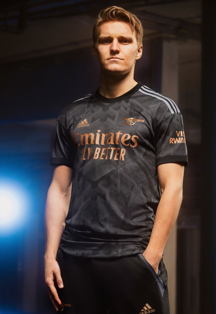
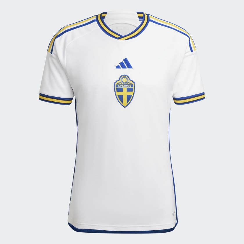
The Euros kits, likely to be launched in the Spring (and subject to recent leaks) give a good indication about the next wave of Adidas shirt construction / general template.

-
...But it will be interesting how far they push the wider merchandising. There's so much potential.
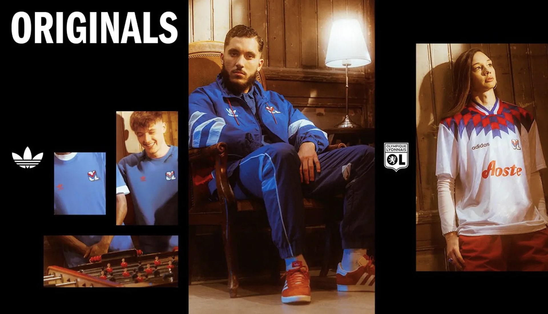
Arsenal, United, and Newcastle all have a history with the brand, so they can mine a rich seam of heritage. United and Arsenal do frequent re-make releases of classic shirts. I'm sure we will see the mid-90s Newcastle shirts get the same treatment.
They also seem to do an 'Icon' series for the Elite tier teams every year inspired by a particular era.
I'd love to see to see some 'alternate history' 70s, 80s and 90s style retro Villa kits using the classic Adidas templates of the time.
Lot's to get excited about.
-
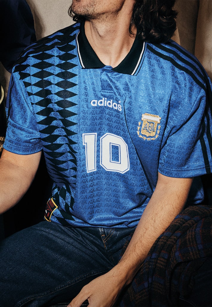
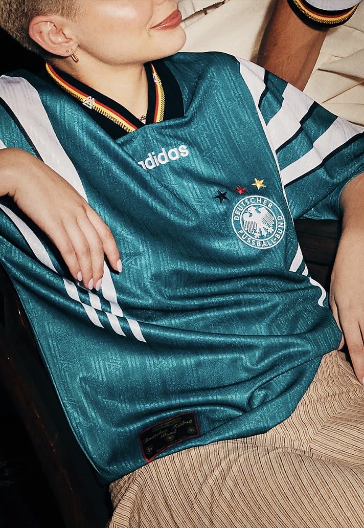
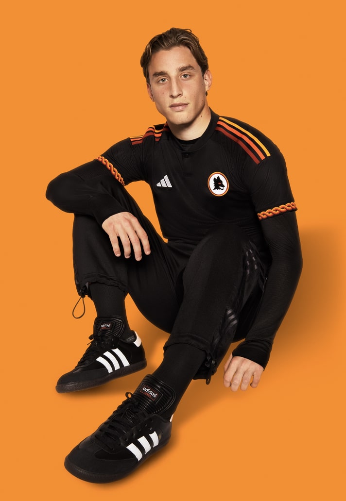
Adidas recent highlights reel:
They seem to be in a real design peak at the moment. Some very simple / classic designs, plus some that push the envelope. I hope we get the long sleeve versions.
-
 1
1
-
-
4 minutes ago, mikeyjavfc said:
The badge being a turd is one thing, but the comms are absolutely terrible. Still no announcement or clarification regarding the new badge a week after it was leaked.
A huge coincidence that just as a significant negative reaction to both the trademarked crest and the handing of the consultation process is building up, a big new deal with Adidas is reported by a major news publication.
-
14 hours ago, Muller Yogurt Long Sleever said:
Working in design and as a Villa fan, the brand identity means a huge amount and it would be a privilege to work on it. That’s why a lot of us can’t (and rightly won’t) let it lie. So a rant, albeit hopefully a constructive one.
Looking back on the last two goes at it:
The previous 2015/2016 version - by a top tier design agency with football club creds, almost certainly working with limitations of an evolution brief, with fan input. Not sure why the colours weren’t sorted, and the ‘Lerner’ crest certainly wasn’t universally liked; but the full lion was beautifully crafted (not so good in 2D), there was a bespoke font and iconography with claw marks and as a coherent body of work, it mostly worked. Elegant, heritage-based, but modern.
Last year’s version - by a top tier design agency with football club creds, I assume working with a more open-minded brief but with fan feedback about elements, which would seem to have limited their thinking and scope somewhat. A well-drawn 2D lion, nicely crafted typeface, presented in two shape options. Fan vote was round badge - and overall it’s well-executed and works. Classic but modern. (Despite me thinking a circle isn’t right for us, but that’s just opinion.)
Both would’ve come at considerable cost (although probably half of Lucas Digne’s weekly wage. Player budget vs marking budget are in different galaxies though.)
But now we’re apparently being presented with something that isn’t fit for purpose nor befitting the prestige it deserves.
People joke about it being made in Microsoft Paint but the crest we’re seeing, if real, is fundamentally unprofessional - cobbled together with elements from the last two efforts within a new crest shape. Arranged awkwardly and trying to solve the colour issue with a chunky drop shadow. If it’s a cost cutting exercise, there’s a good chance it was done in-house or by a cheaper-option contact, as has been suggested. (That’s not a slur on any design resource at the club, I don’t know them, their level, nor their brief; nor indeed if this is what’s happened. Nor do I know Mr.Heck, who has presumably directed and approved the alleged result. Just speculating due to the below-par execution.)
All I can say is if what we’re seeing is true, it’s frustratingly not good enough.
Despite my preference to not have a round badge, I’d take it all day long over what we’re apparently getting. It’ll be very interesting to see if there’s a wider set of assets released alongside the alleged new crest, such as the font and any other bits from this year’s agency effort. It may slightly rescue things.
I’ve always thought the best way to do these very challenging projects is to allow a good agency to run the process, of gleaning a decent amount of fan feedback and insight to develop a solution. But from being involved in this forum, I think there’s a clear case for designer fans with the knowledge, insight and talent to collaborate on such things (as has been suggested). There are clearly people on here (doing some lovely things purely as a passion project. How cost-friendly is that?! Bound to be the same at other clubs.
-
AAANNNND ANOTHER THING - apart from the overall quality of design, something that really grinds my gears is that with a brand refresh coming at the same time as the 150 year anniversary, it was an opportunity to incorporate it in a new visual identity, then proudly move forward with our shiny new look. Yes the 150 is a temporary one-off, but the fact that it seemingly has no correlation whatsoever with the badge stylistically feels wrong (aside from it also being fairly illegible).
-
I had high hopes for Mr.Heck and have to admit I was glad things were going back to the drawing board - but again, that’s personal opinion about the brand, and a separate conversation. There was a coincidental crossover of people at the helm (Purslow-Heck), and I wanted to trust that we had someone who’d steer it in a more innovative, ownable direction whilst respecting fans and history, as much as it wasn’t a great look to change course. On the evidence so far, this is not the case.
I hate being negative and don’t want to sound preachy, but it’s born out of passion and therefore frustrating. It’s mostly opinions, but they come from a decent amount of knowledge and experience. Our identity is for us to own and love, and how we present ourselves to the world. Any re-brand, re-fresh, logo change or whatever, at least needs a sound reason as well as being well executed. Not everyone will love the outcome, but at least have those. Where we allegedly are would seem to cancel any reason because it now looks like change for change’s sake, as well as being poorly made.
So despite the messy process it has been, I’d rather go again and achieve something befitting of our great club. Right now it’s either have something crap which was the result of a less than ideal process, and will be largely disliked moving forward (on the evidence I’ve seen) and probably result in having to do it again sooner rather than later; vs. have something that the majority think looks great and lasts for decades, with the crap process becoming a historical footnote.
(Or simply leave it at what you invested in last year.)
Full judgement reserved until when things are officially released. This may well have been another pointless outburst. But on the off-chance the club are reading through this stuff - please let us help you fix it. The reactions are because this really matters.
Hey we played a game of football today didn’t we?
As a fellow designer, this post does a really good job of expressing pretty much how I feel about the wider situation and the detailed design of the new Trademarked crest.
Someone also made a great point about the cost saving benefits of this remixed version using the existing lion (that is already plastered all over the ground and printed on promotional assets and merchandise stock), which is most likely the driving force behind it. Though of course this won't be the reason expressed to the fans. The decision is based on a short term gain (or minimised loss) rather than long term benefit.
As stated in the middle of the quoted Post, this whole process should have been an opportunity to sort out the visual identity of the Club, not just the crest. The current visual identity is almost non-existent and totally muddled at best. I makes us look small time and amateurish.
We should be entrusting a top agency to do something like this:
https://www.dixonbaxi.com/work/acmilanbrand
https://thisaway.co/work/forward-thinking-football
https://someoneinlondon.com/projects/the-pack-is-back
https://www.nssmag.com/en/sports/30484/venezia-logo-borsche-bureau
https://im.inter.it/en/?utm_source=news&utm_medium=en&utm_campaign=IM
It's interesting to re-watch the video that Dragon Rouge made for the 2 crest options, including the reasoning behind the design decisions (https://www.dragonrouge.com/news/why-our-aston-villa-crest-redesign-is-great-for-all-football-fans-eng/), and hinting at how they could be rolled out.
-
2
-
-
The proposed / leaked crest looks like a bit of a mess. Others have mentioned it but it's like there was an Apprentice task to rebrand Villa in an afternoon. It recycles existing assets (lion, star and colour scheme from the 'old' badge, together with the Font from the rejected Gaslamp crest), adds 1874 in a default neutral font, and places them within a new shield that has been engineered to not look like too much like the current one, or those of other teams.
I think people found the 'Gaslamp' Crest a bit underwhelming, and fans have a real attachment to the old round crest for obvious reasons, so it was never going to win the vote, but it's a solidly designed crest, that resolves a most of the issues with the the AVFC shield. It has a strong distinctive shape, with a nice rationale/story, a good fierce looking lion, nice bespoke typography, decent contrast, and a sense of horizontal and vertical balance. I'd delete the star though if I was to tweak it.
Personally, I'd like something very unique with wow factor like the Juventus J Shield or Venezia's bold V, but the 'Gaslamp' is an acceptable middle ground if the Club feels that it can't stray too far from the norm.
This new leaked 'proposed' shield design, while adding 'Aston Villa', seems to create more problems than it resolves. The vertical balance is off; the small size of the 1874 and its position between the text and lion creates awkward space in the lower centre of the badge; the drop shadow attempting to create some depth and contrast, looks awkward, cheap and dare I say it lazy (Chelsea's badge - we love this comparison! - uses a drop shadow, but in a much more subtle way and the shadow is applied to the dark blue lion on a white background, so it does not stick out like a sore thumb); the double shield outline (forming a triple outline when coloured) adds visual clutter and busyness to the crest, draws the eye away from the main elements; the shape feels over-designed in order to create something that is slightly different from the existing version, and other major British Club shields (Arsenal, Burnley, Everton, Fulham, West Ham, Newcastle, Leeds etc, together with the insert shield in City and United); the text alignment clashes with the point of the shield; 1874 in Helvetica seems like an afterthought; the lion lacks detail and texture, looking flat and low impact.
Ultimately, to undertake yet another re-design in such a short period was never going to work out well. If they wanted to do it they should have taken a year, and launched post-the 150 anniversary. Instead, it looks like it's been fudged in-house with predictable results.
-
2
-
1
-
-
1 minute ago, GarethRDR said:
I totally get that from a functional perspective, but our name really should be at the top as it's possibly the most stand-out thing about us.
Yeah, it's a question of vertical balance. The lion looks like it is standing on one foot precariously balancing on the 1874. Achieving a harmonious balance in a design is tricky. If you look at other premier league badges (including the current AVFC shield), most achieve this reasonably well. Spurs and Palace have birds perching on a ball with text under, but it looks natural
The small size of the 1874 and its position between the text and lion also creates awkward space in the lower centre of the badge. This is made much worse when coloured and scaled down (i.e. on most mobile apps) since you loose the white 1874 within an expanse of sky blue. This is a similar problem to the yellow lion on sky blue that has been an issue for years with the flat version of the badge.
-
2
-
-
-
- Popular Post
- Popular Post
6 minutes ago, TheMelvillan said:when i look at that - with the broadness of the top wording and the tapering at he bottom i see the rough shape of a gas lamp as the overall outline of the badge as a whole.
Wonder if that is deliberate or i'm just tripping
I see a Pizza slice!
 Maybe that says more about me.
-
 5
5
-
Ticks a lot of boxes

-
Not sure if this has been shared on here. Daniel Norris' retro badge remakes.
-
23 hours ago, MrBlack said:
Is he implying that being a bigger fish in a smaller pond meant that they had more power to get Adidas to agree to do a bit of custom work for them?
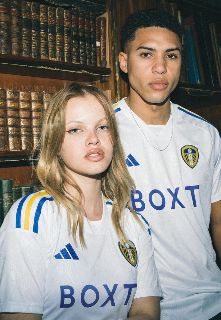
I think, the power dynamic with the shirt sponsors is different to that with the manufacturer. The third party designer says in the podcast, that Adidas gave them strict parameters to work with (e.g this core template, these collar options, shirt base colour, plus 2 accent colours), they then had to work creatively within that. It just so happened the designer was a Leeds fan, so they went to town on the research/development and managed to find a way of maximising what they could do with those elements, which I think the fans have been overwhelmingly happy with.
I'd imagine Leeds, Fulham and Leicester are on a similar contracts with Adidas, far below Arsenal, Man U, Juve, and Bayern, but you can see the difference with what they have managed to come up with when compared to Fulham and Leicester.
I'm fascinated what Villa's attitude is to all this, and what briefs they are giving to the designers. Whether there is any long/medium term strategy on the kits? For example, I'd like to see us go traditional with the home shirt for 2 or 3 years, then every 4th year, bring back stripes or do something different that is still identifiable as a Villa kit. When was the last time we had stripes on the home shirt, 1999/2000? Also, the yellow, 'Brazil style' away kit for 93 is a bit of classic, but they have never gone back to that yellow, blue and claret colour scheme as far as I can remember.
-
23 hours ago, MrBlack said:
Is he implying that being a bigger fish in a smaller pond meant that they had more power to get Adidas to agree to do a bit of custom work for them?
To clarify, the point is that the more the front of shirt sponsors and sleeve sponsors pay, the less likely they are to agree to having their logos in the Club Colour scheme, particularly on the home shirt which will be most visible through the season.
So, I'd hope someone at Villa asked 'BK8' and our sleeve sponsor whether we could have the logos in white during the contract stage, but they obviously ended up with the white and orange logos, which will massively detract from any claret and blue home shirt in my opinion. Makes it look more cluttered.
It's one of the reasons why the podcast is interesting, because it reveals that there's certain things that are beyond club control, or extremely difficult to negotiate, that the designers just have to take on the chin.
-
1
-
-
With the rumours that we might be ending the Castore deal early and switching manufacturer, I've seen Adidas brought up a lot.
There's some concern that we would not be an one of their 'elite' level clubs and therefore get the basic template stuff like Leicester and Leeds etc do.
But, it seems like even in this scenario, there's interesting bespoke things that can be done above just sticking the club badge on a template kit.
I just finished listening to a Podcast (The Square Ball - Leeds fan podcast, but very well done), that explains in a decent amount of detail the process between the designer (Acid FC), Manufacturer (Adidas), Club, and sponsors. The designer does admit, that one of the knock on impacts of relegation, meant that they had enough sway with the sponsors to get all the colours properly matched up to the blue on the home shirt, which probably wouldn't have happened in the Prem (see our orange BK8 monstrosity).
It would be interesting to see what Adidas could do for us, if they partnered up with a kit designer who was a Villa fan
 .
.
Would highly recommend the four episodes on the kit. The first is linked below.
-
18 minutes ago, HKP90 said:
I see what you mean by simple, and I don't disagree with that, but I think we need more than just a Lion.
I just scanned the PL and football league crests and (arguably, some are a bit wonky) 13 teams had a Lion included in some capacity. Of course there are nuances about how they are displayed, but my point is that when someone says 'that team, you know the one with the cockerel standing on a ball', you think Tottenham, because... well, unique. When someone says 'that team with the Lion', they are not going to necessarily think of us. In fact they are, according to most of the sources I've just googled, more likely to think of Chelsea. We'd know, obviously, but the crest is supposed to be a symbol that encapsulates us, and projects our singular image.
No one else has the golden arches. Let's be unique. And not shit, obviously.
I did the same exercise. Chelsea, Middlesbrough, Burnley, Glasgow Rangers, are the main ones I think of.
1860 Munich and Lyon also have prominent Lions.
Then there's the Premier League Logo on the sleeve patch, Holland, Scotland, England, Czech Republic National Teams.
-
4 minutes ago, OutByEaster? said:
Yeah, this. The Lion on its own or the appearance of "Prepared" or "1874" in some places, different types of badge based around the themes we use - a language of images that can be combined in different ways.
I just finished filling out the form and suggested they look at a 'modular' system, which would allow elements to be bolted onto a Crest for some applications, but stripped away from it for the the main uses (Playing Kit and Digital Logos).
The European Champions Star could be placed above the Crest only when we compete in Europe, and 'Prepared' and/or '1874' can be attached in certain circumstances.
But the main element should be simple, bold and unique enough to stand alone.
-
2
-
1
-
-
I really like these 'diamond' shaped badge ideas.
It makes so much sense with the A V shapes, and there's not many around that I can think of (Fiorentina, Wolfsburg, Borussia M'gladback?), so helps to stand out from the crowd.
It also evokes Victorian tiled patterns, and I think there's some similar shapes in the Holte End stained glass, and the old mural facing the pitch at the top of the old Trinity Road stand.
https://historicengland.org.uk/images-books/photos/item/PLA01/08/0004
I'd be tempted to go even more bold, bulkier and abstract with the concept, take the cross bar of the 'A', and perhaps make the angles 90 degrees (a perfect square rotated 45 degrees), since that would better suit expansion into wider checkerboard patterns as part of a wider visual identity for the Club).
You would probably need to redesign a lion that fills/responds to that space nicely.
-
1
-
-
West Ham have done sponsorless shirts for adults for a few years https://www.officialwesthamstore.com/kits/home-kit-202223/adults/
Feels a bit sad to me that we will likely have a sponsor like this going into the 150th anniversary of the Club.
-
- Popular Post
- Popular Post
I think this is the right thread, on the basis that Christian Purslow is in charge of ‘appointing excellent people’ (his words) to move the club forward, whether that is on the playing side, or in wider operations. After 3-4 years, if you look beyond the PR, a lot of things are starting to worry me.
I’ll acknowledge that some good things appear to have been happening at the Academy, with sensible appointments, and some results being seen already, but it’s starting to look a bit of a mess elsewhere.
Over the weekend, I started thinking about some of the things that have gone wrong over the last few years, why these might have happened, and how these issues might relate to key appointments.
Overall, despite the the big talk post-promotion, the on-pitch strategy is difficult to discern. Obviously, hindsight is a wonderful thing, and all clubs have hits and misses, but, it’s equally easy to get caught in a wave of positivity and blindly trust Club decisions and PR.
Pitarch Era
Jesus Garcia Pitarch apparently did a good job at Valencia/Atletico in the 2000s, clubs challenging for champions league at the time. I’m not sure how that was ever going to be transferable to a team trying to rebuild a whole squad and survive in the Premier League.
Yes we needed to sign a lot of players due to the state of the squad, but on the whole the quality of signings was pretty poor. A majority seemed on the risky side with limited English league experience (Mings, Targett, Konsa, Heaton and El Ghazi were relatively safe bets/ known quantities). While players like Trez did a job, the majority of the imports took a long time to settle and delivered little to nothing and have little or no resale value.
Other mid-low table teams signed a range of lower risk options with decent experience that year: Ings, Webster, Bowen, Che Adams, Craig Dawson, James McCarthy, Dean Henderson (Loan), Walker Peters (Loan) Gary Cahill (FREE), Wellbeck (FREE), Callum Robinson, Maupay, Billing etc. You could argue that some of them such as Bowen wouldn’t have come to us at the time due to precarious league position, others were not long-term solutions, but all seemed viable options at similar or in most cases much less money than we spent. All offered at least one element that we lacked, such as physicality, pace, guile, or experience. On the riskier side, it’s worth noting that Sarr and Saint-Maximin both arrived from France that summer for £27m and £15m respectively.
The reluctance to use the loan system and ‘develop other club’s players’ now seems particularly naive and perhaps arrogant given the situation we were in. Arrogance seems like a recurring theme when considering some of the major strategic decisions made over the past few seasons.
Lange Era
Johan Lange is a 42 year old technical director who had previously only held that position at FC Copenhagen between 2014-2020. That team hasn’t finished outside the top 4 since 1999, more often than not winning the championship. Lange has been in post for 5 transfer windows now. I haven’t seen any evidence of any unknown players signed for a relatively small amount that could develop, no hidden gems.
Of the group signed in summer 2020, only Watkins, Cash and Martinez worked, which is around a reasonable 50% success rate. But tellingly, we did not properly address squad weaknesses: size and physicality through the spine of the team, or pace and creativity out wide. Eze, Raphinha, Soucek, Loftus-Cheek, and Dawson all moved that summer to promoted or previously relegation threatened clubs for around £15m or much less, and could have added those elements to the squad.
The Club must have suspected Jack Grealish wanted to leave prior to signing the big contract with the £100m buy out clause. The Club said they always had a plan for life with and without Jack, but I’m not so sure.
It’s easy to say now, but where was the plan for a direct replacement (a powerful ball carrier playing from the left with Prem experience such as ASM, Zaha)? At least then the team shape and playing style wouldn’t need to be changed so drastically.
It’s early days but both Brighton and Leeds have just sold not one but two of their key players (perhaps in both cases their two best players). They have both either identified and signed direct replacements, or promoted squad players, and neither team have experienced the immediate down-turn in form you might have expected, and that we suffered. This might be good recruitment, a clearly defined system, or more likely a combination of both.
Buying 3 players to replace Jack’s output sounded very clever on paper, but it doesn’t really make sense. Despite patchy form in claret and blue, I believe that the three players are all high quality. But even at the time, it was difficult to see how they would fit into the same team. Ings in particular seemed like a PR signing to stem some of the negativity around the Grealish sale. I feel sorry for Dean Smith, it was probably the right time for him to go, but he was likely hamstrung by this strategy.
The midfield/spine still wasn’t addressed for the third summer in a row. There was a lot of talk about Ward-Prowse and Romeu, but we decided to carry on with essentially the same midfield that almost saw us relegated (with a young and untried JJ essentially coming in for Conor). The squad remained unballanced, again lacking size and physicality through the spine, meaning that we had a tendency to be bullied and collapse under pressure.
For me, this summer, the midfield was the area that needed major surgery. I don’t think there’s anything wrong with Mings and Konsa. They’ve showed that they can be a formidable unit in the right system with proper protection. I really like Dougie, but he’s not a sole holding DM. I really like Ramsey, but he shouldn’t be playing every game as a No.8. I don’t think John McGinn is consistent enough to play as a No.8 in this system. I think he’d be an effective squad player option, maybe in an advanced midfield/second striker role (similar to that which Gerrard/Lampard basically played), busting into the box, causing mayhem and belting shots from 15-20 yards.
While Kamara looks an excellent signing, we’ll probably never know if Sanson could work in the midfield, and there needed to be at least one more No.8 signing.
Note: Dan Ashworth was Technical Director at Brighton from Aug 2018 until Feb 2022. He got poached by Newcastle immediately after the new regime took over, which looks like a very smart decision.
Gerrard Era
The Gerrard appointment also now looks arrogant. Immediately after the appointment, I was on the fence, but I reasoned that he must have something if he managed to go unbeaten for a whole season, and then there were impressive Europa League performances. But looking at the SPL table last season, both Celtic and Rangers lost just 3/38 games each, Celtic in winning the league lost 2 in 18/20 and went unbeaten themselves in 16/17.
I look at coaches who have secured Championship promotions with limited budgets over the past few seasons (Frank - a youth international coach since 2008 and Cooper - a youth international coach since 2014) and wonder whether that is a greater achievement than an SPL win.
I’m impressed with what Frank has done with Brentford. On promotion they seemed to turn in to a more pragmatic, tougher, wiser team that are a real pain to play against. I look at the way Forest went at Spurs on Sunday. Their team included a midfield signing from Huddersfield, a no striker front three including two new signings. They attacked in a fast, aggressive, exciting and coherent way and looked like they had been playing together for years. It's one game, but it was shocking and impressive to see this kind of exciting football! Silva at Fulham also seems to have shaped his team into a more robust unit that still carry a threat, with many of the same players that were relegated in spectacular fashion two years ago. They ran Arsenal really close on Saturday night.
I remember that Dean Smith held the title ‘head coach’, but is Gerrard’s title ‘manager’? It appears that he has more influence than Smith, and it has been suggested that Gerrard wanted to change the transfer strategy from young developable players to those that had experience of winning. This would be a worrying sign, having a long term strategy should provide some continuity even when the manager/head coach is changed.
The more I hear about the lack of day-to-day coaching from Gerrard, and the reliance on the coaching and tactical experience of an assistant, the more concerned I get. I understand that some managers work this way, but they have usually ‘been there and done’ the coaching and now take less of a hands on role where experience is key. It is very unusual for a manager to start out in this way, like Gerrard has. It feels like purely a 'personality' based appointment.
After 30-odd games in charge, aside from a handful of strong performances, usually against struggling teams, I don’t see much of an identity. Where we have looked good is during the early weeks and the home games against City and Liverpool, when we tightened up. Surely this was a blueprint for going forwards? What I do see more often are stodgy performances and bad habits such as conceding early goals, goals straight after half-time, or multiple goals in short periods. The game plan seems to be, ‘play like Liverpool’, but we don’t have some of the World’s best players at full back, centre back, or in-attack. Fundamental flaws remain week after week.
Other miscellaneous things bugging me
Some fans may not see these things as important, but don’t really see things progressing off the pitch.
- We are still plagued by strange betting company sponsorships on the shirt, from WW88, to whatever it was last year, to the latest version. None of these companies seem to have any real presence online.
- The club jumped on the Crypto bandwagon with the Socios fan token launch.
- We seem to have downgraded from Kappa, an established kit manufacturer, to a new entry in the market that has come from nowhere and now produces for loads of teams in the UK and Europe. It all looks a bit cheap to me. I know Kappa got some criticism, but in my opinion they made very stylish and well thought-out kits. The player spec versions were particularly impressive and I thought they gave our players an imposing look. We were the brand’s only premier league team, and one of their top 5 teams in Europe.
- At kick-off, the bells and whistles to get the crowd amped up, seem counterintuitive. Does anyone really like High Ho Silver Lining and what is the strange choral music that we walk out to? All of this just drowns out the organic atmosphere that can be so special at Villa Park.
- The quality and level of service for food and drink in the stadium is still really poor.
-
15
-
8
-
-
Interesting to see that Venezia have just ditched their round crest including a lion, to something much more abstract built around a 'V'.
I imagine this is a bit marmite, but personally I love it. Looks great in Gold on the shirt.
https://www.nssmag.com/en/sports/30278/venezia-changed-logo

-
3
-
-
I was thinking the same thing about the third kit, then wondered the same thing about last years and the year before. How many league games have we won in those three 3rd kits since promotion!?


.jpg)
.jpg)
.jpg)
.jpg)


.png.822b456e0e336399e48d0450e6c63a5a.png)
Future Club Crest & Brand Identity
in Villa Talk
Posted
It looks to me like a late 1800s 'Arts & Crafts' style pattern. Birmingham was a key city in that the Arts & Crafts movement, around the time of the Club's formation. Nice link to the 150 year anniversary